


About this article
In this article, we will discuss how we created a tool to facilitate building flow charts. These charts would be required to follow certain business rules and would integrate into a host software – the application that includes this tool as a subset of its functionality.
This write-up is a two part series, the first of which is detailed below.
Part 2 of the series can be found here.
Part 1
In the first part, we will take a look at what the tool does to begin with, then follow it up with an analysis of the requirements and finally what our options were in terms of technology and availability of tools and libraries.
About the tool
Many of us have used or seen flowcharts in software development where they’ve typically been used as illustrations to depict a particular process flow. The act of mapping out a process using flow charts would serve to define and/or clarify our understanding of it, and help improve the process if necessary.
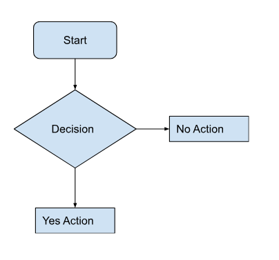
Fig. 1 below illustrates what a simple chart would look like. You would have shapes and connectors between shapes. Each shape would carry a label to describe a step in the process flow and the connectors would describe the path(s) through the process that the chart is intended to depict.
Fig 1.
In our case, the tool would be used to identify the causes for equipment failure. This, as the function implies, would be called the Cause Mapping tool – an industry jargon to visually map the causes of incidental failure that may result in a larger breakdown of an ideal working state system.
The general idea would be to identify reasons for failure as causes and map those to their corresponding effects in a chain of cascading cause and effect relationships. This, however, need not be restricted only to identifying problem causes, but instead serve as both, an effective risk management methodology by pre-empting problem causes and also to map successful workflows to be replicated in other systems.
More details on the principle of Cause Mapping and the relevant details can be read @ Thinkreliability – Root-Cause-Analysis.
The requirement analysis
As with all software undertakings, this one too had its lists of must haves, and could haves. Besides the litany of features (see later) that would be built into the tool, the tool was required to:
- Function as a web-based tool that integrated into an existing .NET application.
- Be largely client-side with the ability to remotely persist application state.
- Be host application technology agnostic. What that meant was that the tool could and would in fact be repurposed into another software host that ran on Java and hence it could not per-se be limited in form or function to any one platform.
- Preferably built using open source tools that had permissive licenses to use and modify their code base as necessary.
On the face of it, these requirements seemed quite reasonable and we would account for them by:
- Using HTML in the browser as a means of building the web-based tool as opposed to any proprietary technology (read Flash or Silverlight)
- Coding in javascript for the bulk of the tool’s feature set. This would make it mostly platform agnostic with the exception of having the persistence layer written in the host application’s technology base.
- Leveraging open source frameworks (for MV code organisation and graphing capabilities) in conjunction with the native cross browser SVG support
Our choice of libraries
Since the tool required us to cover relatively new ground in terms of development, all within a set timeframe (this not being the typical line-of-business app but instead a graphical tool with a good deal of user interaction) the ability to quickly build a stable framework was paramount.
The guiding principle was that we’d spend about 3 quarters of the project time on building and perfecting the graphing aspect of the tool and probably a quarter of the time building up a decent code base for tying up the interactivity and state management.
The framework choices
We zeroed down on the MVC pattern as the preferred route of code organisation, since it offered a clear separation of concerns leading to a cleaner code base. The question in front of us was which framework to opt for, since javascript frameworks were dime a dozen and the MVC one’s weren’t limited either.
We looked at the options in hand and amongst them Angular, Backbone and Ember js stood out as the plausible candidates. Zeroing down on the framework to use, meant satisfying the following:
- Have at least a minimal set of features to support the MVC pattern without too much boilerplate code.
- Be easy to pick up and get working within a span of 2-3 days.
- Should work seamless with jquery, since we would rely heavily on widgets, and jquery had literally 100’s of them in the marketplace and many of very good quality.
- Have a robust support community. Typically any search related to a specific problem should yield at least 5-8 good links.
Angular was the most robust of all frameworks, with an enviable feature set, was MVC out-of-the box and had great community support. It also had an emerging widget market, although the breadth and scope of widgets was yet to match jquery. It however had a steeper learning curve.
Ember had a sound templating system with 2 way data binding much like Angular but without the attendant learning curve, and since it was relatively new, community support was not seen to be as complete.
Backbone was the framework of choice for us here, because it offered MVC with a minimum learning curve – helps in bootstrapping the application quickly. Backbone also enjoyed a large community of users, since it was one of the earliest successful javascript frameworks in the market. This coupled with a useful templating system (using Underscore js) meant it had all we needed to be productive.
The graphing engine
At the heart of a cause mapping tool is shapes and connectors. The ability to draw and interactively transform shapes with their connectors meant we’d have to work with a vector based toolkit, one that went beyond the basics of supporting shapes, lines and color fills. The toolkit would also require the ability to measure, scale, colourise, layer or otherwise transform the native HTML canvas object.
There are some useful tool kits that work precisely to deliver these very objectives. The ones we looked at were Fabric© js, Mxgraph, Jointjs (with their Rappid prototyping library), Draw2d and JsPlumb. Among all, Fabric©js was the only open source free library that enjoyed currency amongst the development community. The remaining were more capable tools with greater out-of-the-box capabilities, but they were all licensed products upwards of $500/per developer.
We decided to go with Fabric© js, which as a library, abstracts some of the underlying complexities of working natively with the HTML canvas and provides a useful API to quickly create and manipulate geometric shapes.
Although Fabric© js provides the building blocks, you’d typically have to write your own code (and that involves a fair amount of elementary geometry) to create a useful charting tool. Our decision here was guided more by the cost factor than the native capabilities of the tool. This is not to say that Fabric©js was incapable, quite the contrary, but other libraries offered features out-of-the-box albeit at a price.
Table of Contents