As designers and developers of the web, we want everything to look beautiful and be practical at the same time. We face challenges while doing so and one such challenge was that we faced while creating the web portal for LASALLE College of the Arts, Singapore.
LASALLE is the Asia’s leading tertiary institution in cutting edge contemporary arts and design education and practice. They were looking for building a portal with a focus on accessibility for all, where the students can showcase their art and the marketing team can reach out to the masses via articles.
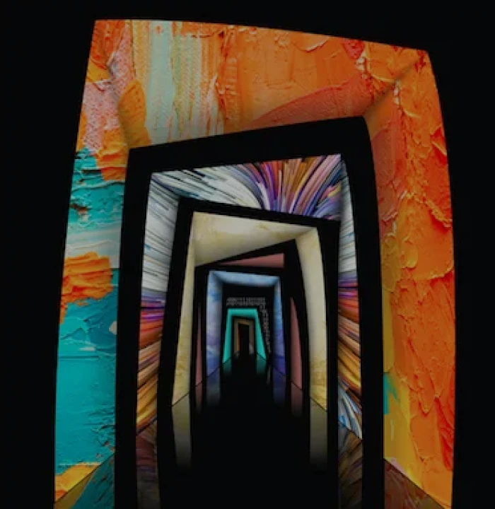
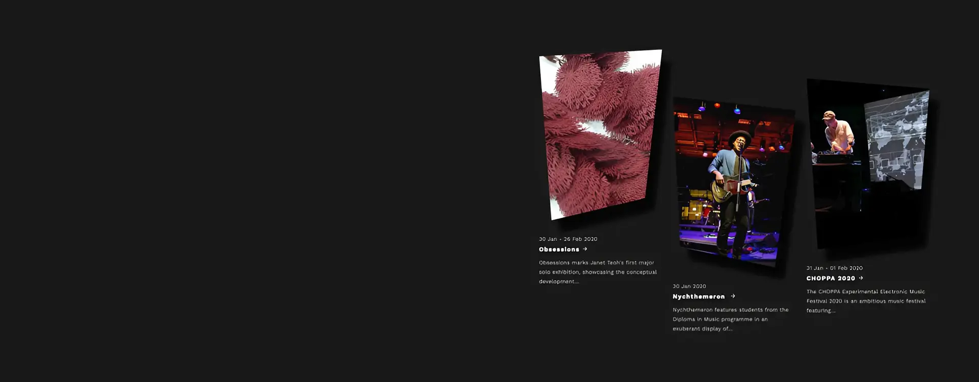
What makes this project impressive is that the design team (M&C Saatchi Singapore) have done an excellent job of capturing LASALLE in a single geometric shape.
When we looked at the requirements, Drupal was our ‘go to’ CMS which provided us with a concrete structure to build up on. The only part which we had to figure out was how to construct a method or a process which can take care of the key element (i.e., the ‘polygon’ shape) which is displayed across the website.
Now, it would have been an easy job for us if there were only a few images and if the project was a static website. But this wasn’t the case! We tried different solutions like styling with CSS and using PNG images. But these solutions have their own pros and cons. For example, you can create a box shadow for a div but when it comes to irregular shapes, CSS fails.
The other potential workaround with CSS was to create two similar shapes overlaying each other, mask the image inside the foreground layer and use the background layer like a shadow. But as the site was meant to be responsive, the workaround was not an easy gig to maintain.
The solution needed to work on all web browsers and CSS fails with some browsers. (You know that browser)!
While you can crop an image to any shape you like and export it to PNG, it could fail if you don’t know how to do it correctly and maintain the file size for optimised web performance. Say, for instance, an end user may not be able to crop and modify the images like how a designer can.
So, in the given scenario, we felt that using the SVG format would be an ideal solution.
Why we used SVG?
- Since it’s an XML-based markup language, it allowed us to make it a reusable component.
- We could scale to any size without losing clarity (except very tiny).
- It looked great on retina displays.
- It had design control like interactivity and filters.
- We could use it to compress to small file sizes too.
How we did it?
We first created an SVG with the view box size as per the design specs, for example, viewBox=”0 0 366 510″. It is important that the “Height” and “width” match the “viewBox” parameters and this viewBox will act as the container for our shape.
Next, we will define the points of the shape considering the viewBox. We need to make sure that we do not plot outside the defined container.
For example, <polygon fill=”#fff” fill-opacity=”0″ id=”poly2-13″ points=”0 20.4,366 0,314.76 443.7,36.6 510″></polygon>
The image which will be rendered inside the polygon should fill the entire polygon and to accomplish this, we set the “preserveAspectRatio” equal to “xMidYMid meet”.
You can see that the polygon has a shadow. In order to achieve it, we used the “filter” method of SVG and assigned this filter as a class to our defined polygon.
The only TO DO that was left was to pass the image to the SVG. We did this by using the “xlink:href” method of SVG.
With this method, we were able to replicate the designer’s vision and didn’t had to worry about cropping the images or browser incompatibility.
Thus, in conclusion, using the SVG format seems to be the best solution for creating irregular shapes such as a polygon. Though it takes some time to get the SVG polygons and the scaling right, it pays off well in the long run.
Table of Contents


